Hart Dairy are serious about producing milk that is better for the consumer, the cows, and the planet. They approached us to develop a brand identity and packaging design, tailored to the USA and Chinese fast-moving consumer goods (FMCG) mega markets.
The supermarket shelves in the USA and China are jam-packed with copious dairy brands. Hart Dairy needed a way for their products to stand out and showcase their key point of difference: diary produced by cows that are pasture-raised and grass-fed every single day of the year.
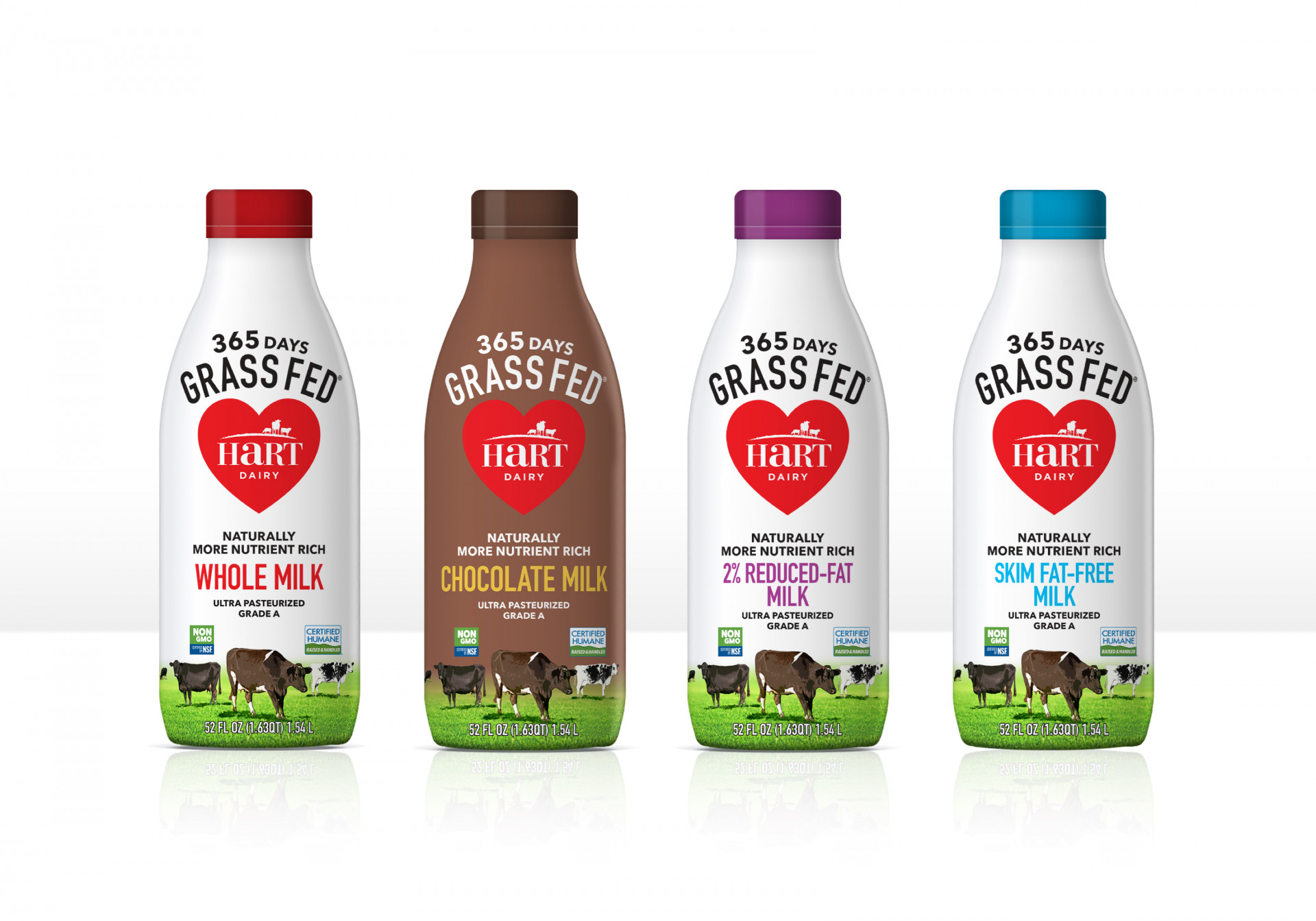
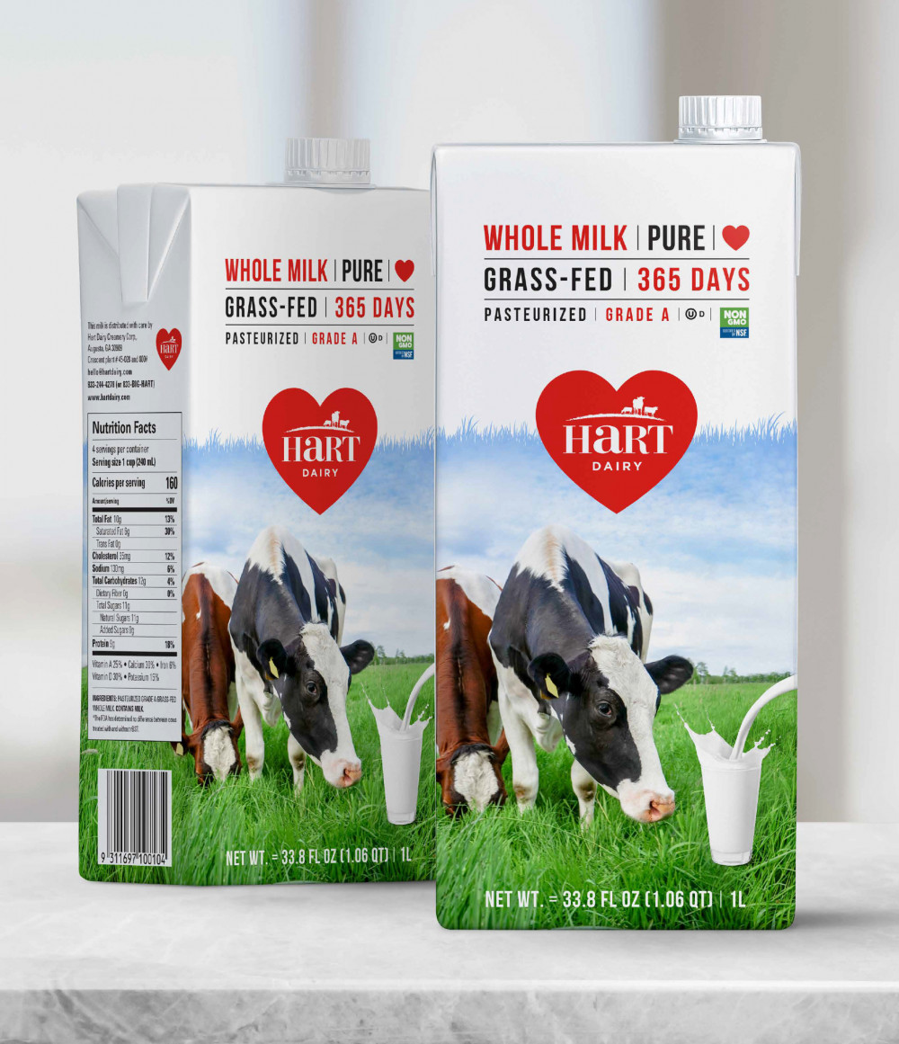
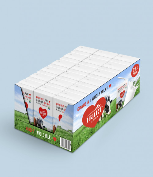
To help Hart Dairy milk stand out on crowded shelves, bold colours were employed: a dynamic red (with the obvious link to the company name), supported by an eye-catching, clean palette of blue, black, and white.
Communicating the product’s unique offer
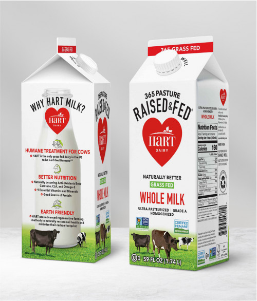
Hart Dairy wanted their product’s point-of-difference to be more dominant on their packaging than graphic elements.
The designs we developed took this into consideration, with the key messages (eg 365 Pasture Raised & Fed) dominating the packaging for their milk cartons. The packaging also prominently features their key products offers (humane treatment for cows, better nutrition, and earth-friendly).
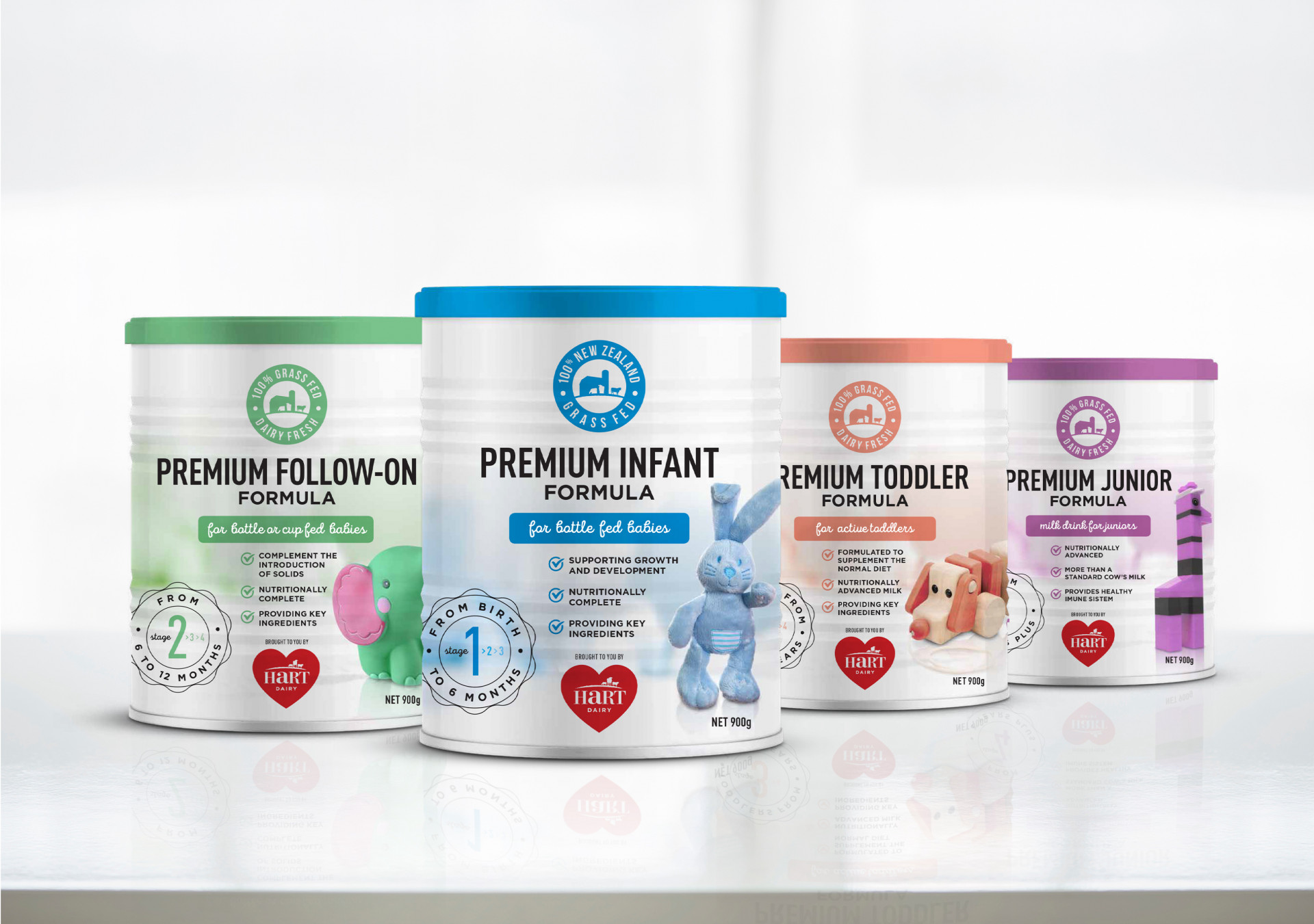
Design for a distinctive milk formula
While still clearly communicating the key benefits of the product (eg 100% grass fed), the design for the infant formula packaging was tailored to the specific target market.
For example, the intended age/stage for the formula is prominently displayed and supported by graphics chosen to depict each age/stage.
Images that do the talking
For the long-life milk market in China, Hart Dairy needed a Tetra packaging design that would cut through the language barrier by using images, rather than words, to clearly communicate two key elements: what the product is, and the Hart Dairy point-of-difference (that their cows are exclusively grass-fed).
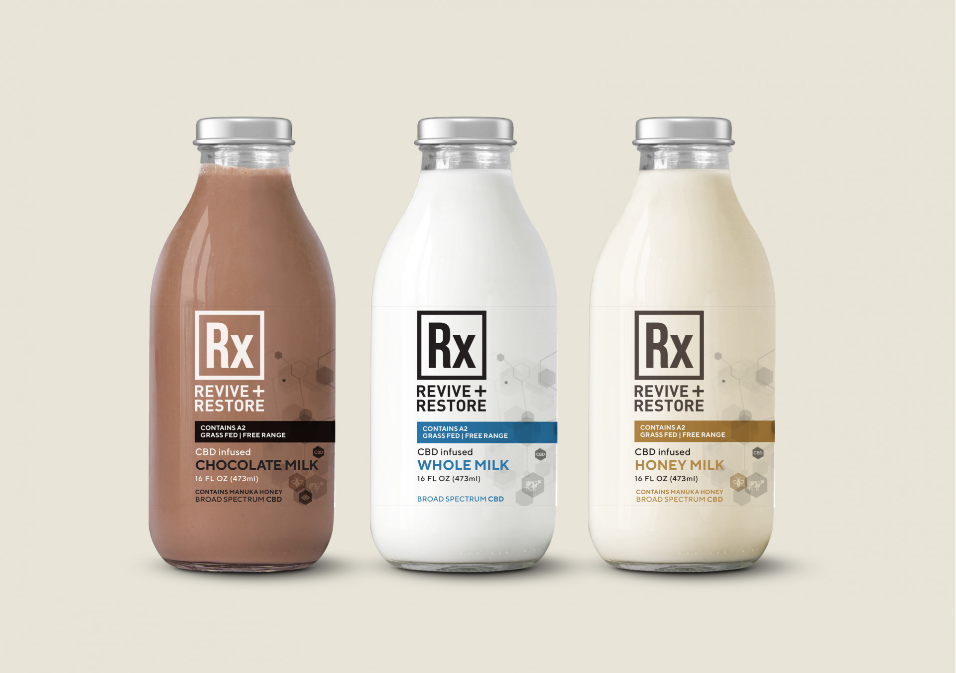
Bespoke design for an exclusive product concept
Hart Dairy were looking for ways to diversify their offer, with one of their product ideas being for a milk product infused with broad spectrum CBD and other elements that appeal to health-conscious consumers (eg Manuka honey).
The target audience for this concept product are affluent consumers with an interest in tech-focussed bio health. To appeal to this market, Hart asked us to come up with a label design for a glass bottle that clearly communicates the product concept, with a more tech-focussed, engineered, and premium feel than their other products.
We also designed brand collateral for this Rx concept product, which clearly highlights the key health benefits and bio-tech appeal of the product.
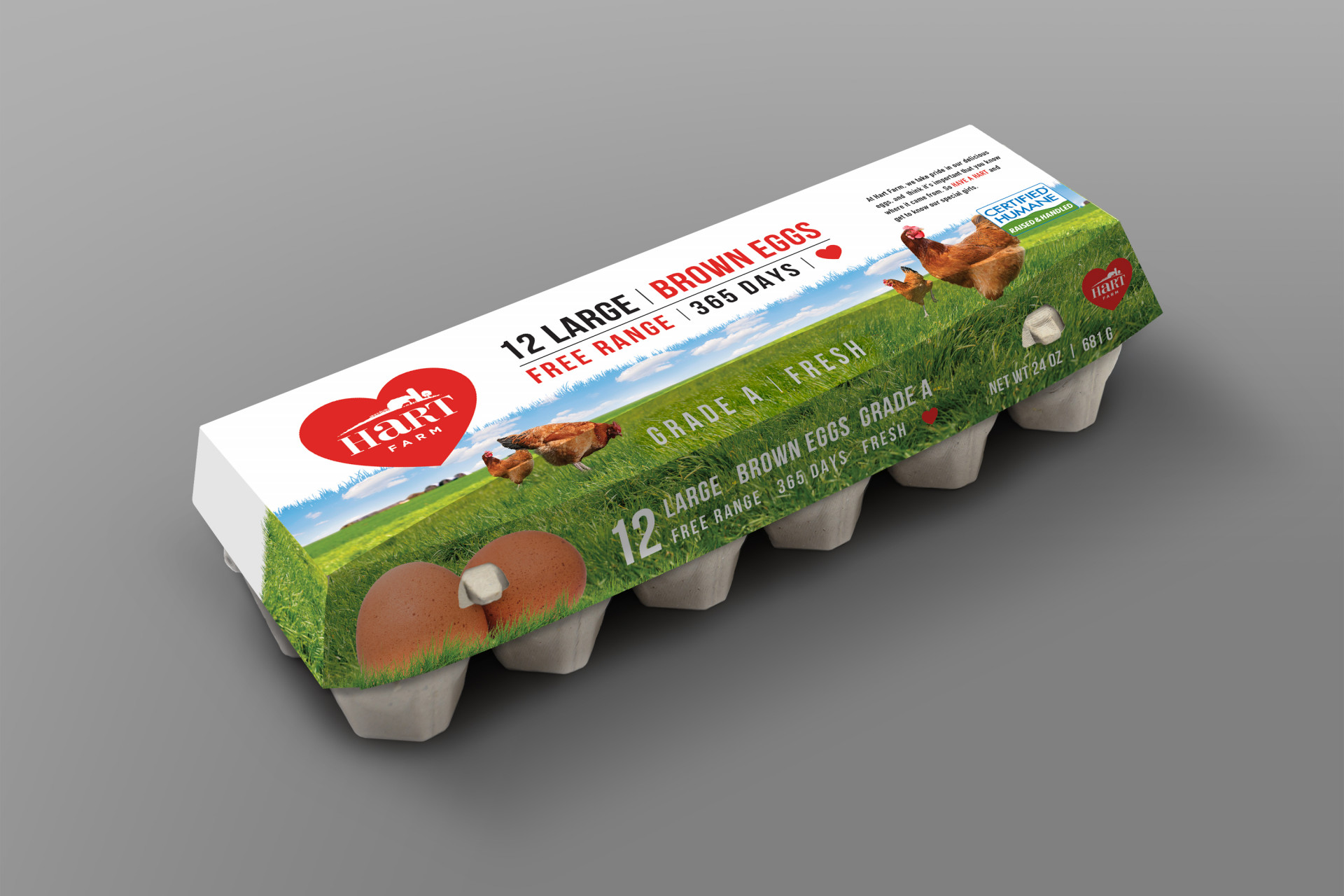
Extending the brand
As another way to diversify, Hart Dairy were investigating options to branch out into other areas of farm produce (Hart Farm). To support this, we developed a packaging design for a free range egg product concept. This built on the overall look and feel of the Hart Dairy packaging, to ensure instant wider brand recognition.
Investigating innovative packaging options
When Hart Dairy wanted to investigate the use of bottles instead of Tetrapak cartons for their milk, we developed a design for use on shrink sleeve labels.
The advantage of these custom shrink sleeve labels is that they wrap around the entire container, giving a 360-degree branding area, with the added advantage of a tamper-evident seal.