Life Health Foods New Zealand were taking two of their brands - So Good and Sanitarium Ezy Oats into international markets.
They approached us to use their existing local brand packaging design and adapt it for the market in India and Australia.
We kept the core elements of the existing brands and injected new secondary supporting graphics. These were used to visually communicate with the new international target markets who were unfamiliar with the brands.
Introducing a brand
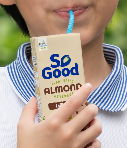
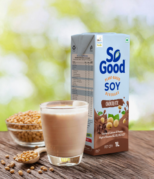
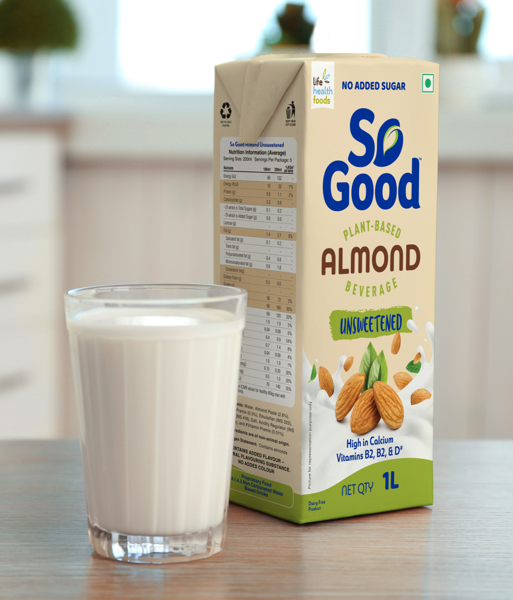
So Good was an unknown brand in India. Our challenge was to introduce the brand to the Indian market using graphics tailored to illustrate what the product is, and to signal that it is intended for the Indian market.
To achieve this we used the central graphic depicting soy beans and milk (liquid) on all the packages, with the clever use of colour distinguishing the different varieties of soy milk (eg chocolate brown for Chocolate flavour, etc). We also included a small Indian flag at the top right of the container to succinctly communicate that the product is for the Indian market.
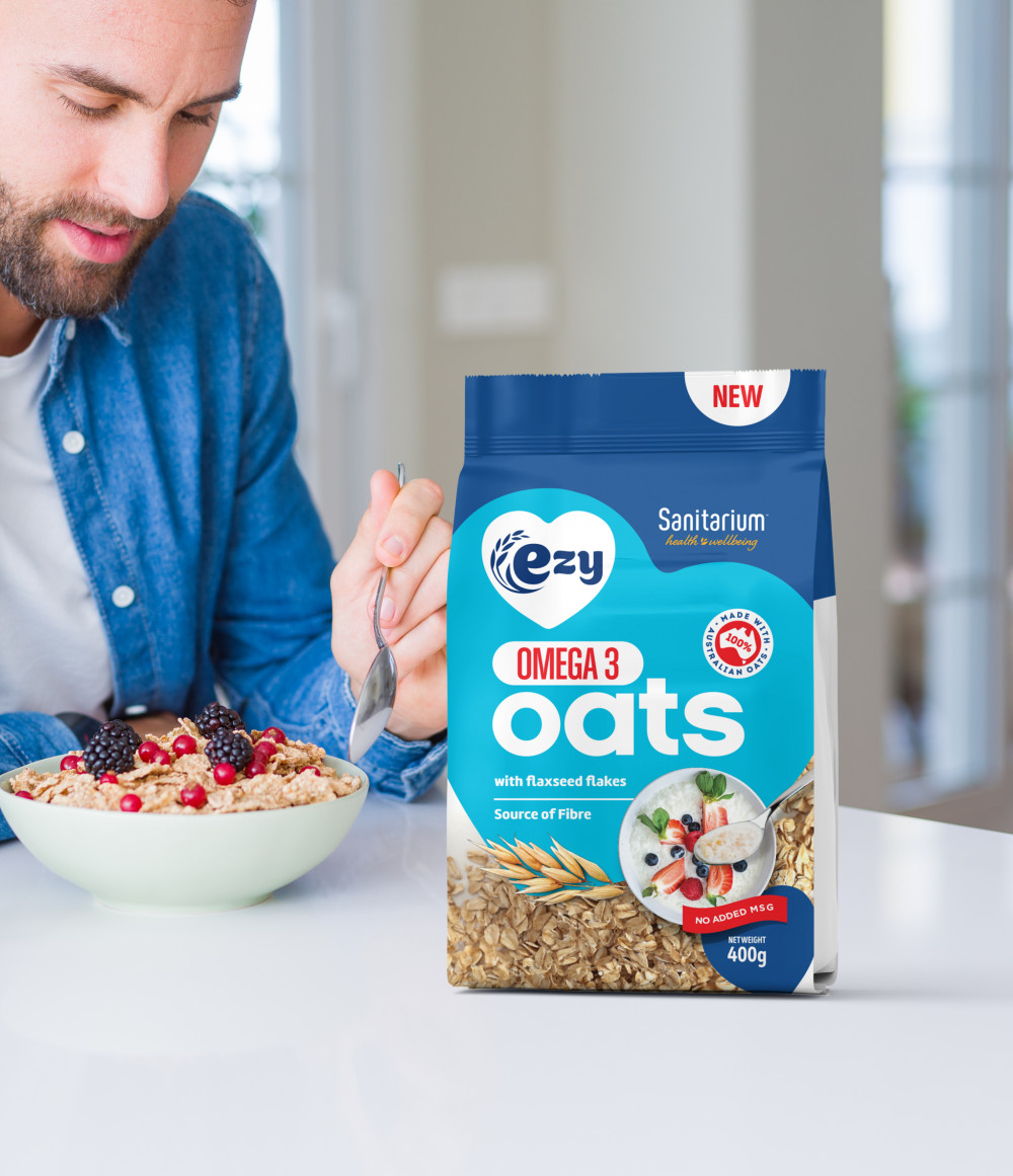
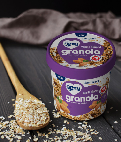
A delicious standout
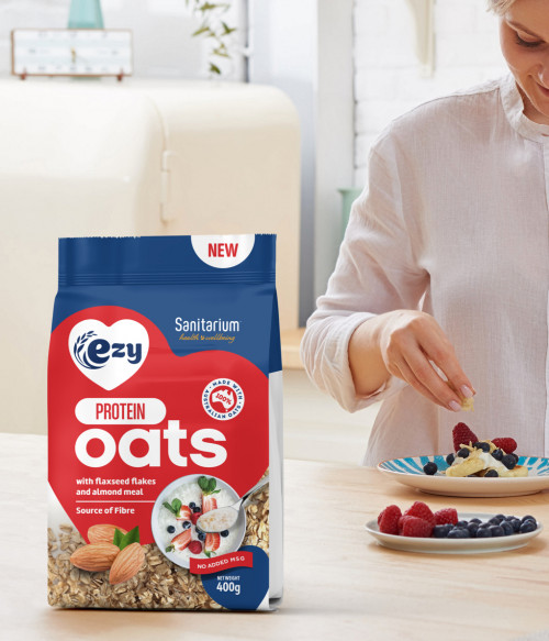
For the Sanitarium Ezy Oats packaging, we needed a way to introduce the oats to the Australian market, and to ensure it stands out on the shelf next to all the other FMCGs.
We therefore used prominent messaging regarding the key health benefits of the oats (eg Omega 3, Protein, Antioxidant, etc), and ensured the photographic visuals support the message of a delicious, fresh, and healthy product.
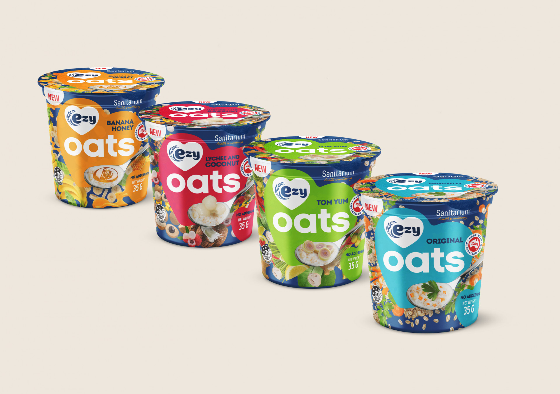
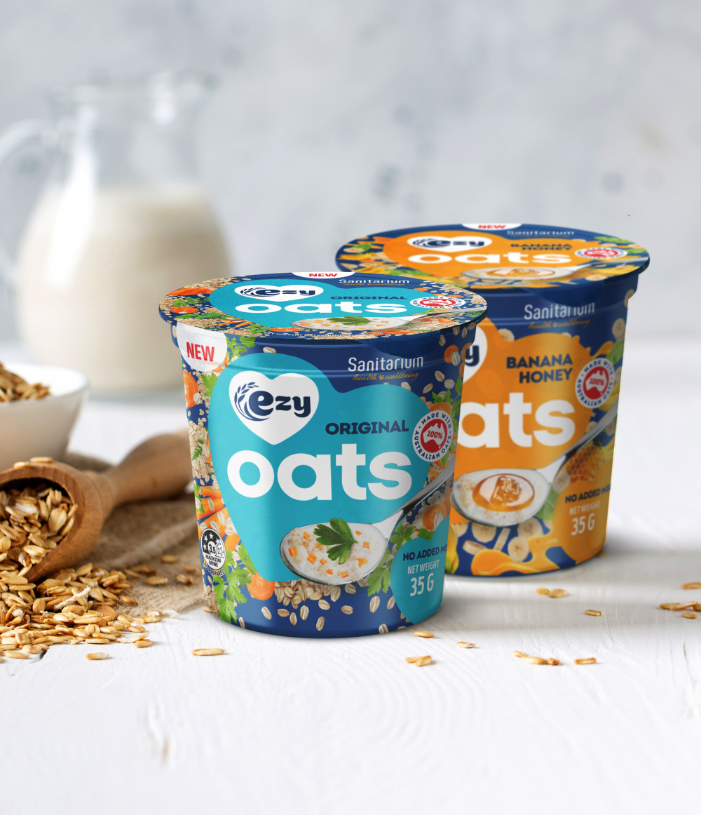
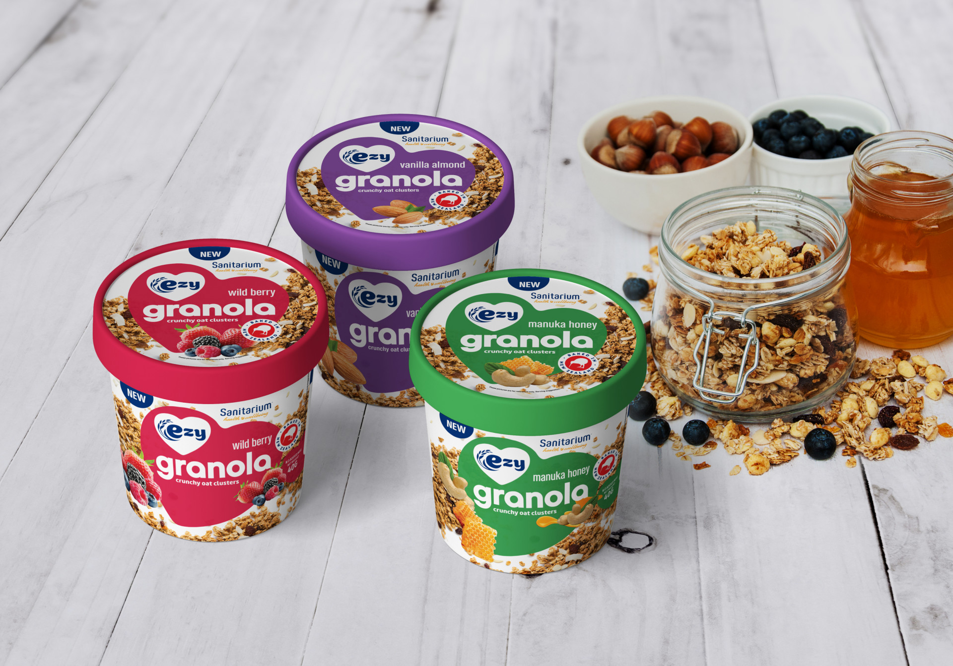
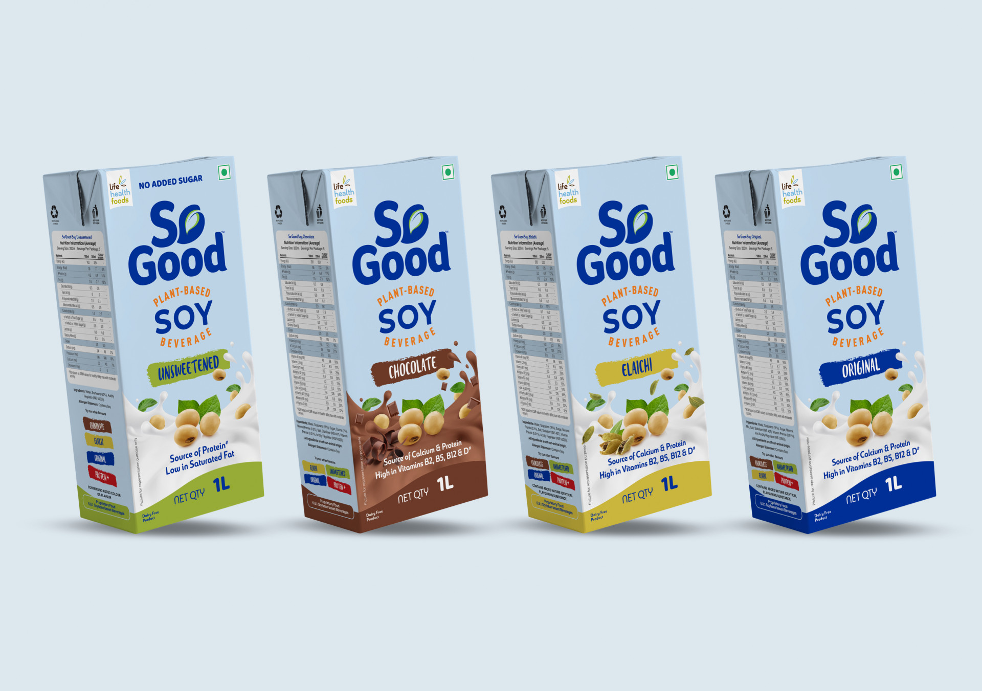
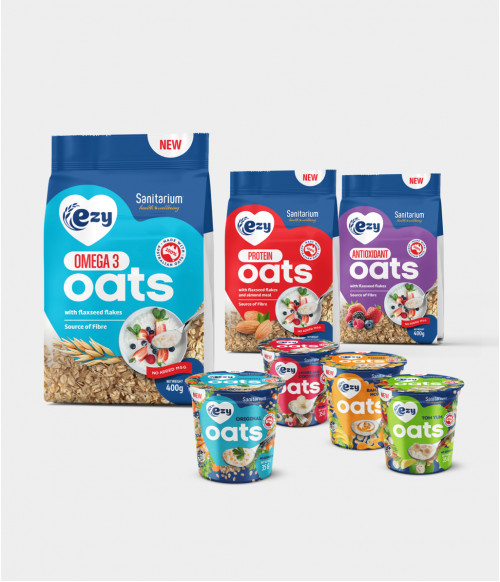
A consistent look that allows differences to shine
Once again, key visual elements were duplicated across all packaging to ensure a consistent look. Smaller visual cues were then included to distinguish the different varieties and flavours.
For example, replacing the contents on the spoon shown on the package, as well as using different background colours, help to clearly distinguish the different flavour varieties of the single serve oat bowls.