
Our challenge was to create a strong and credible brand design that was practical, scalable, and visually aligned with the high standards NorthWater brings to every project; a design that would distinguish NorthWater from other civil and infrastructure competitors.
NorthWater are a proudly Māori-owned business and have an innovative, technology-centric approach to ensure “clean drinking water delivered through sustainable infrastructure practices”.


Brand Identity
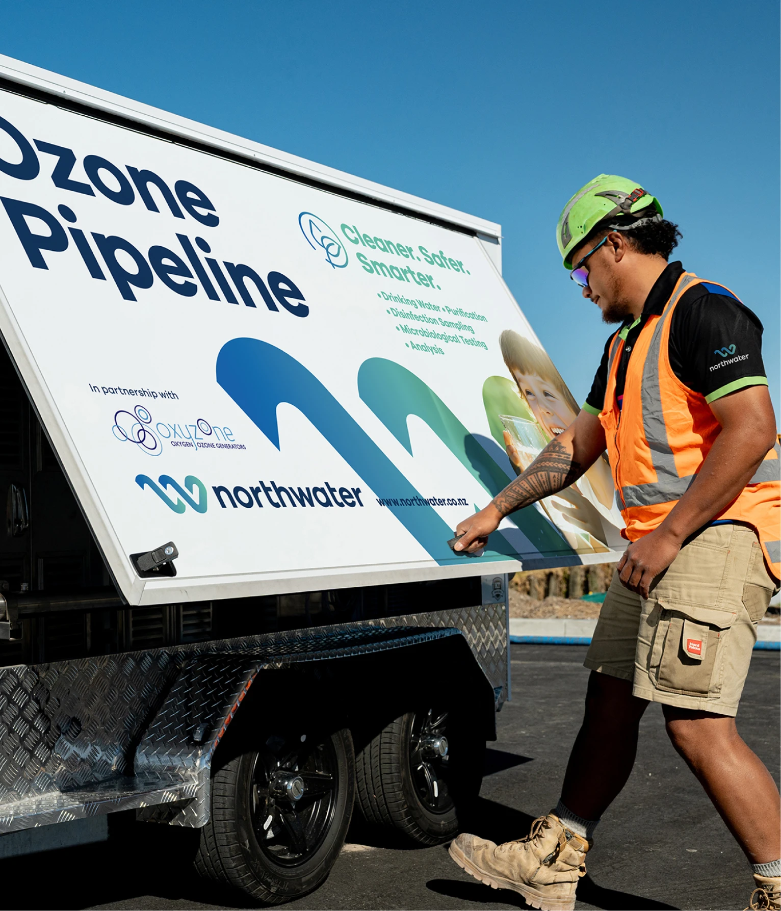
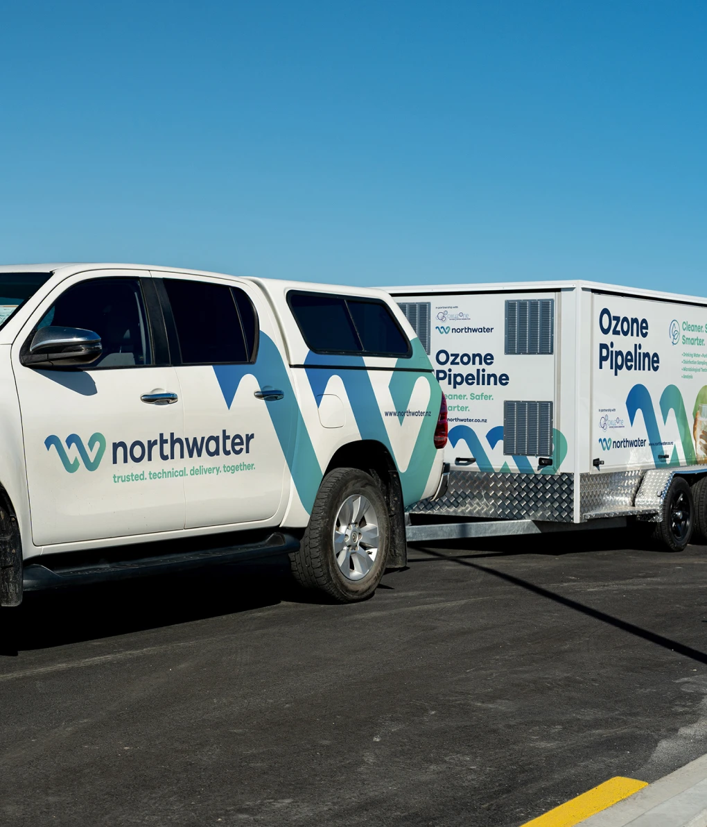
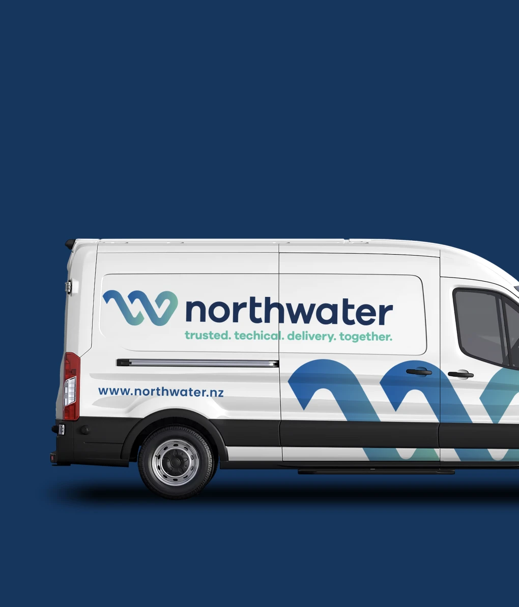
We crafted a bold, confident brand identity anchored by a strong logomark that references flow, connection, and engineering precision. The wordmark is modern and solid, with subtle geometric refinements that reflect infrastructure and dependability. A distinctive colour palette balances high-vis visibility with corporate professionalism — ensuring the brand stands out on-site and in boardrooms alike.

Print Design
Toast developed a full suite of branded materials including for stationery, business cards, document layouts, and uniforms. Each piece was designed to reinforce NorthWater’s values of professionalism, precision, and trust — whether viewed on a construction site or in a project proposal.

Website Design & Build
We designed and built a clean, easy to manage, responsive website that communicates NorthWater’s capabilities, experience, and commitment to quality. With intuitive navigation, strong visuals, and concise content, the site acts as both a capability showcase, a lead-generation tool, and a representation of NorthWater’s commitment to the community. Built on Silverstripe, it gives NorthWater full flexibility to evolve their content as they grow.
Services Provided
- Brand Strategy & Identity Design
- Logo & Visual System
- Print Collateral
- Vehicle & Uniform Branding
- Website Design & Development
Outcome
NorthWater now has a brand and digital presence that matches their operational excellence. The refreshed identity has strengthened their market perception and improved recognition across the industry. With a cohesive visual system and a clear message, they’re well-equipped to win new work and grow with confidence.
