APS are nationwide commercial property maintenance and remediation specialists, covering everything from heritage building restoration to regular cleaning and maintenance.
With an extensive fleet of vehicles around New Zealand, APS wanted to use these as ‘moving billboards’ to promote the APS brand. They approached us to design fleet signage that would achieve this goal. As part of this, they asked us to help boost their brand identity, including redesigning their existing logo.
For their brand identity, key mandatories were to include the triangle shape that was a central element of their existing brand, and to ensure a uniquely New Zealand feel that would separate them from their competitors.
As part of the full branding package, they also asked us to develop their website - to showcase the huge range of services they provide.

A proudly NZ brand
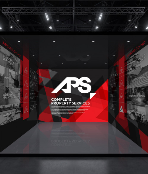
The New Zealand feel for the brand identity was achieved through the use of red and black.
This striking colour palette is accompanied by the triangle motif, which is woven throughout all touch points. To illustrate the wide range of services APS offer, we developed a comprehensive set of icons which also incorporate this ubiquitous triangle concept.
The brand identity
APS asked us to modernise their existing logo and ensure it is legible on a moving fleet of vans. We presented them with a range of different options to take their existing logo to the next level, as well as a wildcard: a new logo.
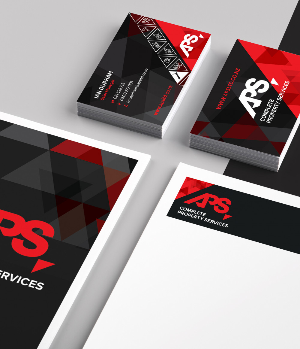
We developed the new logo by integrating the letters 'A', 'P', 'S' into a stand-alone lockup that could be used in very large format (eg on their fleet), and still be legible when used small (eg letterheads, etc).
They loved the new logo and so, keeping the triangle theme in mind, we used the 45-degree triangle from the logo as a key secondary brand element. This was used widely across all brand collateral to create a consistent brand identity. To help ensure brand consistency across all media, we also provided APS with a comprehensive set of brand guidelines.
Uniformed iconography
Icons were a big part of the existing APS brand identity and they wanted this to be carried forward for their updated brand. We ensured a uniform look for their large number of icons – each depicting a different service that APS offers.
Attention-grabbing fleet signage
The APS fleet consists of a wide range of vehicle types. Our challenge was to develop a custom design solution for the unique shape of each vehicle type, whilst still ensuring a consistent brand identity. It was here that the new APS logo and the strong triangle motif really shines, as well as the clever inclusion of icons on the larger vehicles.
Brand collateral
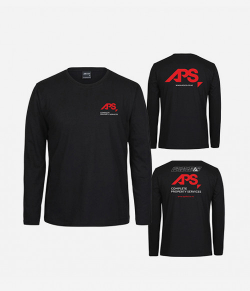
As part of our comprehensive branding package for APS, we designed a wide range of brand collateral: everything from business cards to notepads and merchandise. We even created a custom tender/quote template for them in Microsoft Word!